You could say that every genre has its own aesthetic, but lately the YA horror genre has been taking aesthetic to a new level – beyond cover design, or even typeface and chapter headings.
 The first YA novel that did this really effectively was Miss Peregrine’s Home for Peculiar Children – a novel which some might argue isn’t really horror. But even if it is fantasy, it’s super creepy fantasy with invisible monsters that eat children.
Using real photographs, Ransom Riggs created a story. The photographs became a kind of evidence for the text. Sure, you could read the story (or listen to it on audiobook) without looking at the pictures, and you’d still get a creepy fantasy tale. But the photographs were what drew me in. They were mysterious, and did I mention real? Of course, they were originally created using Victorian-era special effects, but the idea of finding these strange images made me as a reader feel just like Jacob, sifting through his grandfather’s collection. The page layouts were even made to look like scrapbook pages. I’ll call this style the Old-Timey aesthetic.

Quickly after the publication of Miss Peregrine’s, I began to notice other YA horror books using images and elaborate page design to draw readers into the story. The Asylum series by Madeleine Roux had images that looked like they were found on the tiled floors of an old asylum. Also included were images of scribbled notebook pages akin to what the narrator was finding and/or writing.
I enjoyed the feel of this series even though I didn’t enjoy the story as much – and part of my lack of enjoyment of later books might have been reading them as ebooks, which made them feel somehow less authentic. I also found that some of the images were clearly photoshopped which made them feel less authentic than those in Miss Peregrine’s.

In the Shadow of Blackbirds by Cat Winters also uses photographs to great effect – a look at the copyright page shows that most of the photos are from the Library of Congress. These photos are entirely separate from the story, but mirror the events: seances, spirit photography, army hospitals, and flu victims, all of which ground the story to the time period. The author did a great job of doing that through her writing, but the aesthetic of the book took it that much further. You can see that the chapter headings also had a 1920s flair.
YA horror novels about historical events have a great advantage by the ability to use photographs. But there’s another YA horror aesthetic that doesn’t. I like to call it the House of Leaves aesthetic, where even the words on the page are arranged to lure the reader deep into a troubled protagonist’s mind.
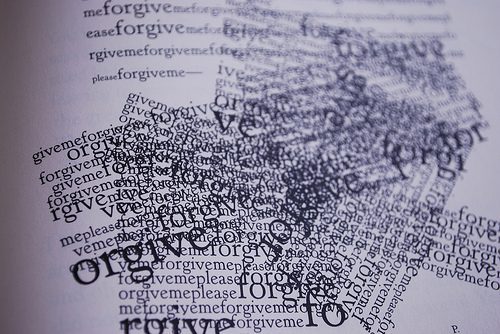 (If you haven’t read House of Leaves, it’s a very complex story within a story within a story (perhaps even two more levels deep here). There are footnotes, there’s word art (see image on right), there are hidden codes. It took me months to read this book.)
Dawn Kurtagich’s novels The Dead House and And the Trees Crept In (UK title: Creeper Man) were definitely inspired by House of Leaves and have many similar elements – the word art, and the story within a story. There are journal pages and words crossed out. In The Dead House, the novel is meant to look entirely like a compilation of files and journal pages and transcripts.

Both of these books are very psychological in nature, where the characters question their own sanity, and the disordered fonts/cross-outs reflect that – while the appearance of “official documents” and files lend an authenticity to the story.
This aesthetic isn’t limited to YA horror (see House of Leaves, also the horror/comedy novel Horrostor which is laid out like an IKEA catalog – the story takes place within such a store), and it certainly isn’t limited to horror, but it seems the genre most befitting this type of treatment are horror novels.
And I love it!
(Did I miss any other examples of YA horror aesthetic? Please let me know in the comments!)
